So you’re working on a new design. You’ve got a grid down, right? (take a look at our grid article if you need a refresher) The next step is to get the elements in a visual hierarchy. And while those might be some fancy words, the phrase really just means making it clear to your viewer which elements are more important. Give the reader an order to follow, using visual cues and they’ll understand your message much easier!
When every element has the same visual weight, when there’s no clear focal point, readers are confused and quickly move on to the next page, ad, billboard, whatever is the next thing trying to get their attention.
Take the reader through the design by leading them with the visual weight of each item. Think of it like a guided tour: start here, then look at this item, then look at that item, then look over here.
Do you want viewers to see the headline first? Make it the largest element. Maybe you have an attention-getting image and you want that to be the main focus, then the headline might be next, then the subhead and then the body copy and so on.
So how can you change up the visual weight of your elements? Try these graphic design tactics:
- Size: make it larger than the other elements and it quickly becomes more noticeable
- Font weight: choose the bold version of a font and that text starts to get attention
- Position: in left-to-right reading cultures, the reader naturally starts to engage in a design at the upper left corner, so placing your element in that position can bring the eyeballs
- Color: the use of color as a visual weight is relative to other colors in the design, but can very effective. Think of how yellow feels lighter than dark purple.
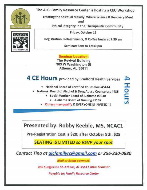
Here’s a great before and after to highlight visual hierarchy. The image on the left is a flyer from a non-profit we saw in our Facebook feed. We were able to make the flyer much easier to understand, just by applying some basic visual hierarchy tactics. See if you can name the ones we used