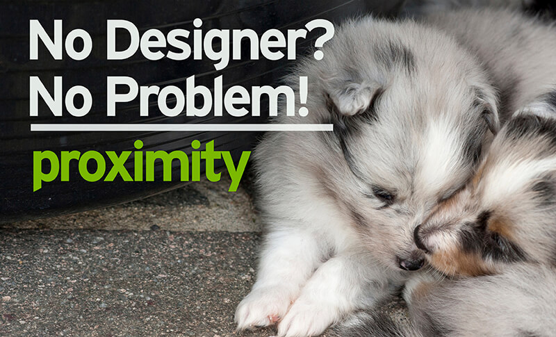
In our post covering The Grid, we spent some time discussing why you should organize the various elements in your visual design. Proximity is one of the ways to organize into a grid. We’re just putting items that go together, closer together. Closeness: the definition of proximity according to good ol’ Merriam-Webster. And what could be a cuter visual of closeness than a puppy pile!
But how does closeness – proximity – help our customers better understand our message? Why does it matter?
By grouping similar items together, especially the items which provide vital information, the reader can more quickly get to the heart of your message. We don’t want to make the reader work any harder than they have to. Proximity helps your viewer feel a connection to your brand more quickly through concise, organized visuals.
Let’s take a look at a recent ad we did for Credit Union of Georgia. See all of the copy over there by the rate? Imagine if “personal loan” was somewhere else on the ad, say maybe above the headline. The viewer would still see it, but wouldn’t know how it related to the rest of the copy. By grouping all of the copy related to the actual product (“personal loan,” rate, “as low as,” “APR”) we’re helping the viewer understand the product more clearly. This is using proximity, or closeness, as a design principle.

So remember to use proximity the next time you have a design that’s starting to look and feel cluttered. Remember your visual hierarchy, the grid, then group like-minded elements together. We’d love to see how you use proximity in your pieces! Share them below or email them in!
Want tips like these delivered straight to your inbox? Sign up for our emails using the widget in the top right!