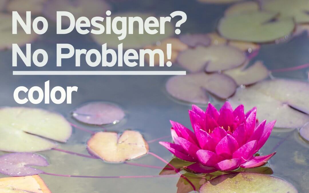
The big, wide wonderful world of color! So many topics related to color and design! We could talk about:
- how colors can give a brand, a logo, certain personality traits
- what colors work well with other colors (color combinations)
- how color can impact mood and influence decision-making
- and so much more!
There are entire courses and college classes dedicated to color theory, but today, let’s just focus on how you can use color to better communicate your message.
So what colors should you use?
The best place to start is with your brand’s color palette. Make sure those colors are used and used well in your design. When you use them consistently and intentionally your brand will get stronger and feel more familiar and trustworthy to your audience. Just consult your brand’s style guide. (See our articles “Just What Is A Style Guide Anyway?” and “How A Style Guide Can Boost Your Brand And Save You Money” for more info.)
Beyond your brand’s colors, select colors related to your message and/or any main visual elements. Say you are creating a graphic for a spring auto loan promotion – using bright pinks, yellows, greens or even those in pastel shades will help reinforce the springtime feeling. Or maybe you are using a photo of your employees at a community event as your primary visual? Select colors which appear in the photo and you’ll quickly have a design which feels cohesive.
Where to put what colors?
As you think about the more important elements of your design, think about prioritizing your colors as well. Select one color to use for your higher priority element(s), then use that color sparingly. For instance, you might use your corporate blue in the logo and only in a few other small areas. Or you might select a deep orange to highlight your call to action, then just use that color in that one location. Using specific colors with purpose just in a few places, is one of our favorites methods of pointing a reader’s attention to a specific area.
Another place to use color is where you’d like items or pieces of information to work together as a group. By placing them close together (see our Proximity article) AND using a similar color, the viewer will understand the items as they relate to each other.
Color in action
Let’s take a look at the impact color can have with a few examples.
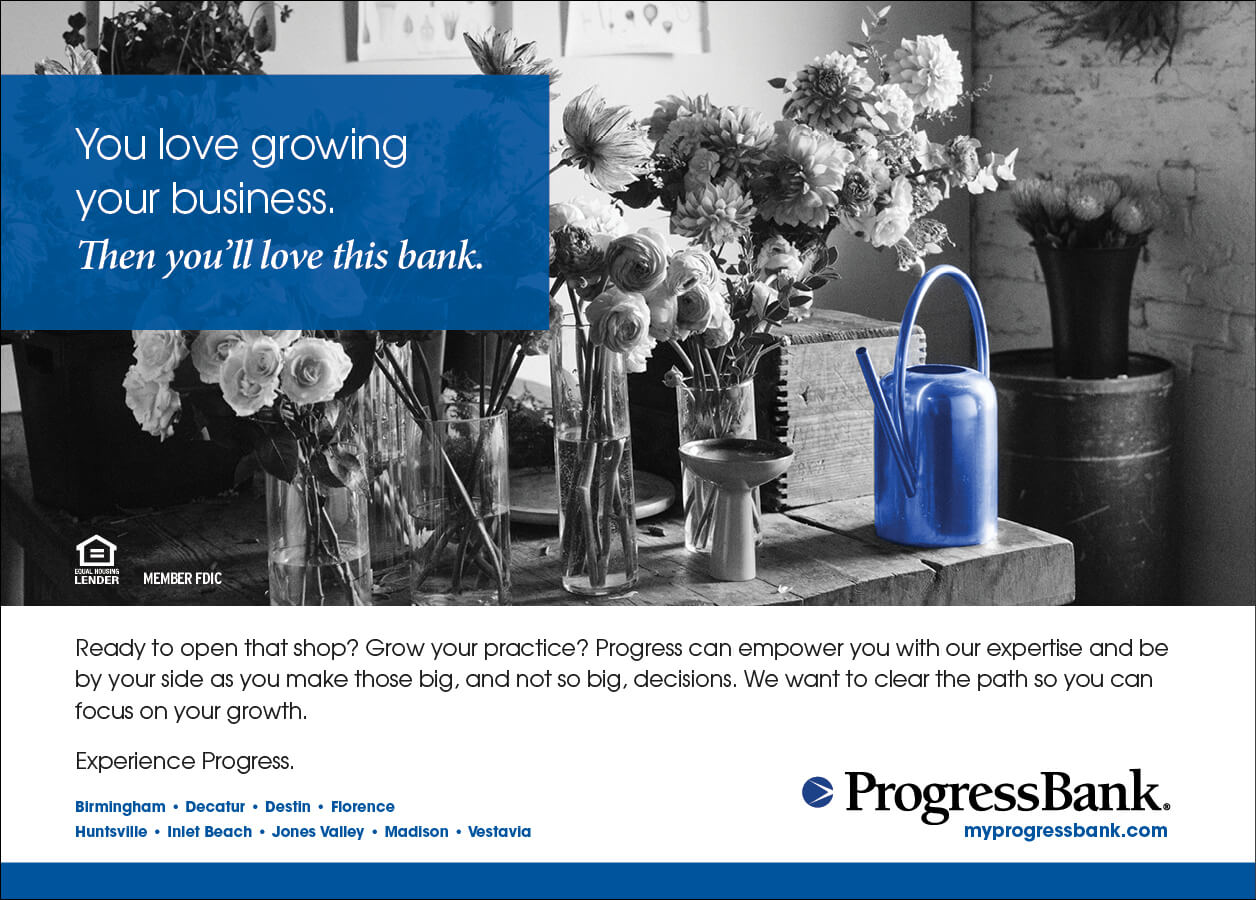
This first one is a campaign for a client which really uses a lot of different design principles, that’s why you’ll see it used as an example quite a bit. Color, and the lack of, really play a central role in this design. Using their blue against a black and white image really helps the design pop. And the way the blue is used throughout the design leads the reader’s eye from the top left corner down to the bottom right – oh look! There’s the logo! 🙂
This next example looks to be full of color – lots of green in this calendar cover, right? We wanted the image to certainly take center stage, while ensuring the branding is noticed. By using the corporate colors mainly in that one spot, the viewer will definitely move their eye in that direction. You might even notice the tiny bits of red and yellow in the image itself? The person in the window? That little bit of color does help to tie in the logo to the photo.

Another interesting use of color in this design is the push and pull of complementary colors. Remember that color theory class I mentioned at the start of this article? In color theory, the way colors work with or against each other is studied. For instance, red and green are on opposite sides of the color wheel, therefore they contrast with each other. When they are used together all sorts of visual experiences are going on, whether we realize it or not. Here’s a cool color calculator to try out and learn more! But to keep it simple here, you can see in this design that the red really pops of of that green image. That’s color theory in action.
So be mindful with your color selections and locations, then you’ll start to see your designs having more impact!
Want tips like these delivered straight to your inbox? Sign up for our emails using the widget in the top right!