Movement without animation or video? Yes, even static visuals can create movement for a viewer! Here’s why it happens and how you can do it in your designs.
First off, we have to agree that we’re creating visuals for viewers who’s language is left-to-right reading. Most western cultures follow this pattern, so if you are designing for people who read English, French, Spanish, etc. then these techniques are for you.
Why does this matter? Well, we want to take advantage of a reader’s natural tendencies. They will typically start at the top left corner of a communication piece, then read to the right, then come back to the left, etc.
When we arrange our elements to work with those tendencies, our designs will have movement. Movement which creates interest, appeal, and definitely makes our communication more clear.
Sometimes we can even cheat those movement tendencies and use some visuals to encourage movement.
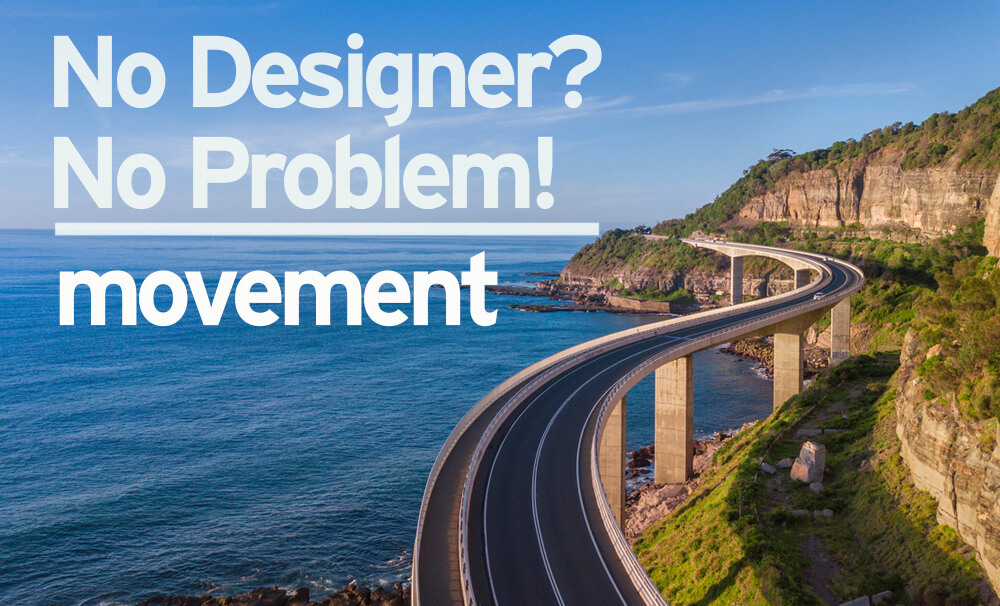
Take a look at this flyer we created for PrimeSouth Bank.

The background image was selected for several reasons – it gave the design plenty of copy space, it feels sophisticated and aspirational, and as an added bonus there’s a great diagonal element which leads the eye straight to the logo. Bingo!
In the example below, the reader will start with the text at the top, and as they finish reading/scanning the text, the shape of the person and their tablet in the photo leads the eye back up to the text. This reinforces that copy, helping to draw attention to the contact information again.

So the next time you’re working on a marketing or advertising piece, think about how you are leading a reader through your information using visual cues. Work to keep them moving towards your main message, your logo, your contact info – whatever you deem as more important.