The Challenge:
Progress Bank is a community bank headquartered in Huntsville, Alabama. Only ten years into their charter and they are already giving more established area banks healthy competition. With a name like Progress, brand materials must be modern and with a customer base leaning towards high-level professionals, the designs must also be sophisticated and elegant. How could their brand stand apart from other financial institutions while attracting the right audience?
The Outcome:
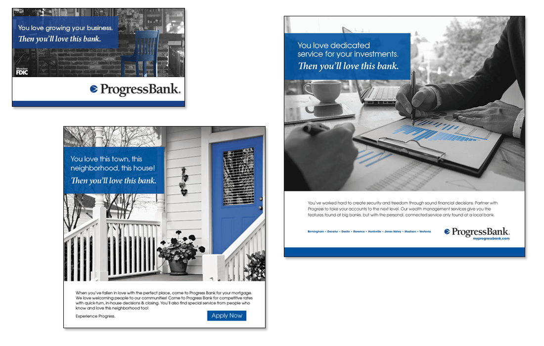
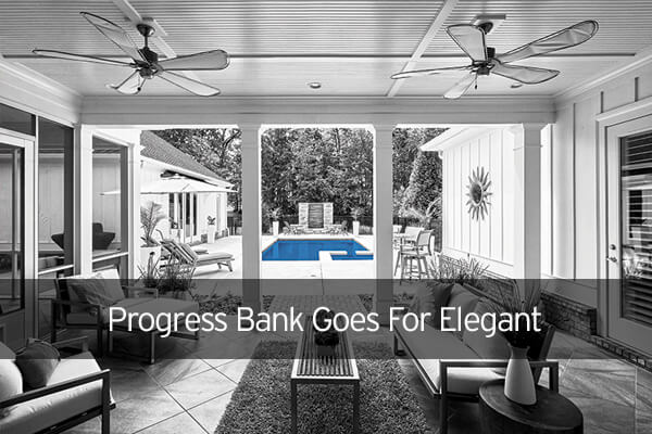
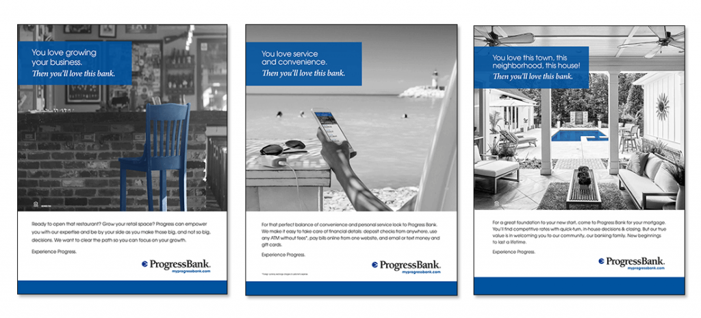
Progress Bank has a wonderful relationship with their clients and community. They knew the standard images of happy families typically used in financial industry advertising would not reflect their culture or get the attention of their target audience. With detailed data on Progress’ current clients, combined with extensive research and experience in the financial industry, black and white photography and videography was selected as the featured design element.
In our work for Progress, we look for scenes which build an aspirational feeling, setting the stage for what Progress clients could attain by using their products and services. The featured photos and videos use a pop of Progress blue to draw the eye into the scene. This design evokes a more refined and studied approach to financial services, setting Progress apart from their competition. Sophisticated photography is not typically seen in their competitors’ marketing. The attention to detail in these print, digital and video pieces reflects Progress’ higher level of attention and service to their clients.
