Patterns are a great design tool to bring interest and dimension to your visuals. By repeating shapes or other elements you can dress up large areas of space, and even guide your viewer to specific parts of your design, as in your logo or a call to action.
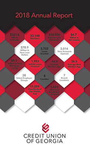
In the latest annual report cover we did for Credit Union of Georgia, you’ll see pattern used prominently in the design.
The main reason for using pattern, specifically with the diamond shape, was to reinforce their new branding. The new logo for Credit Union of Georgia features a stacked / dimensional icon which calls to mind a diamond shape. By using that shape over and over we’re helping their members become more familiar with that shape.
The placement of the pattern itself was used to draw attention to the title and the logo, as those areas do not use the pattern. So those color fields give the viewer’s eyes some rest, allowing them a moment to read the title and really see the logo.
So the next time you’re staring at a blank screen, wondering what imagery you can use, consider how pattern might help your design. You might just find it’s a design principal you’ll use time and again!


