Case Study
Progress Bank
Take a peek at how this comprehensive advertising campaign for Progress Bank came together with clear ideas and beautiful execution.
Client Stats
Asset Size: $1.5B (as of 3Q20)
HQ: Huntsville, Alabama
Branches: 11 (Alabama & Florida)
Target Audience
Upper Income Brackets
Entrepreneurial-minded
Urban and Suburban Lifestyles
Distribution
Paid: local magazines, television, radio, digital, outdoor
Owned: website, branches, online banking
Creative Process
Collaboration, a clear target audience, and cohesive creative were key elements to this successful campaign.
Collaboration
The Marketing Vice President at Progress Bank came to me with the fantastic idea to play off of the “progress” in their name: what would “progress” sound or look like? She knew she wanted TV and radio ads, along with print and digital, so we brought in a video producer as part of the concepting phase. We’ve worked together on other campaigns as well, so I knew this would be another fun and creative process.
Clear Target Audience
Progress Bank has a very defined demo- and psychographic they target. This is very important to the success and growth they’ve experienced. Progress is not trying to be a bank for everyone. They know they are more closely aligned with those who have an entrepreneurial spirit, medical professionals who run their own practice, higher income urban and suburbanites.
Cohesive Creative
Progress understands consistency is key to brand recognition and trust-building. The concept, copy, and design needed to be cohesive, yet flexible enough to work on different platforms and media. The creative elements also needed to be versatile enough to promote different product & service offerings: mortgages, business services, investing, even promoting the digital features of Progress Bank.
Creative Direction
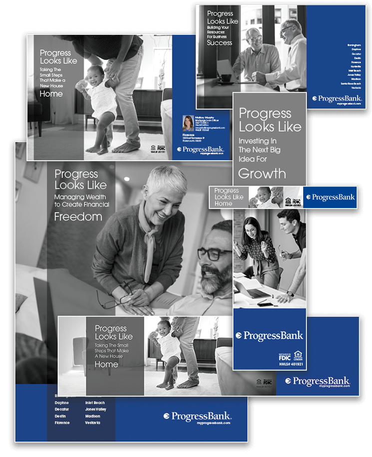
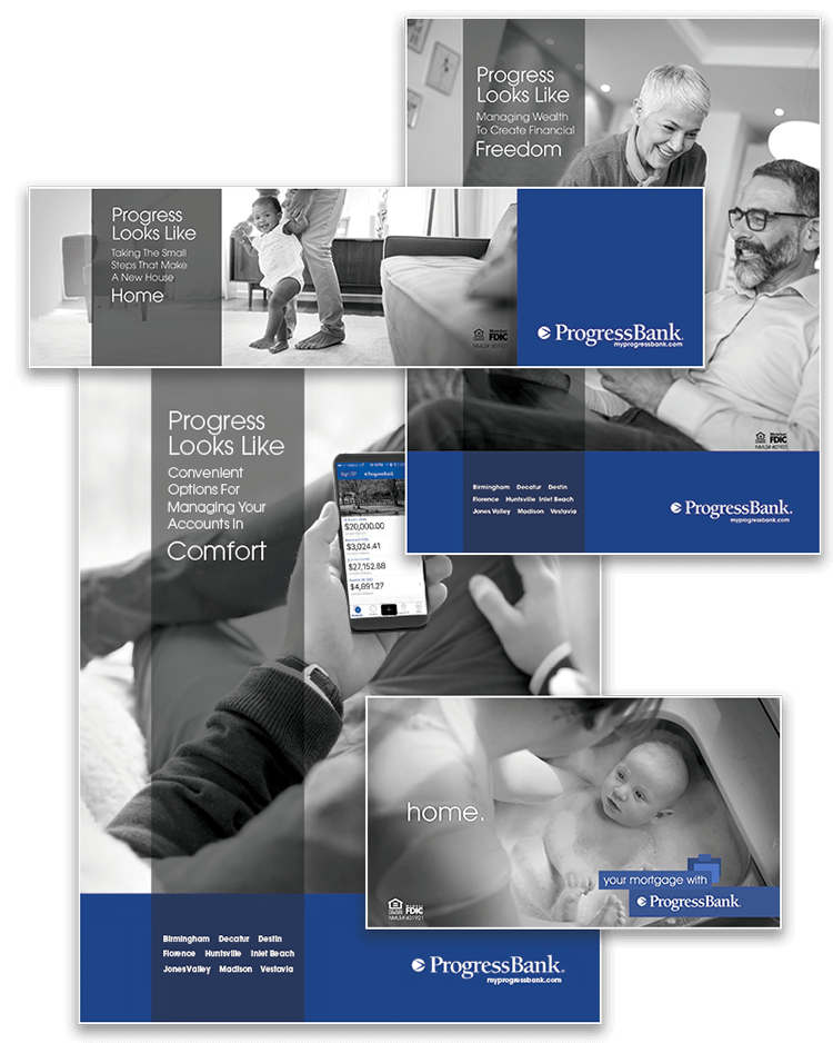
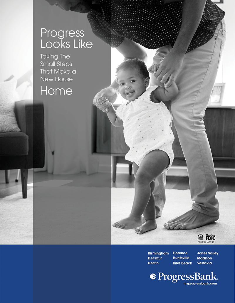
The over-arching design for this campaign imparts a sophisticated feel by using black and white imagery, minimal copy, and well-organized elements. Keeping the various elements ‘corraled’ in their own sections provides plenty of visual space for the imagery to demand attention and for the viewer to immerse themselves in the ambiance. The intention is for the prospective client to feel, hear, see what Progress looks like, sounds like and imagine themselves experiencing Progress (Bank) for themselves.
The over-arching copy plays on the double meaning of “progress” while using key phrasing to draw attention to the benefits of being a Progress Bank client. The headlines had to be flexible enough to work throughout the different product offerings, while conveying aspiration and motivation.

Elegant Design
Cohesive Creative
Aspirational Feel
Television
Collaborating with Storyboard Creative to produce television, radio, and other audio/visual pieces for Progress Bank is a real treat! We all work together during the concept phase, I’ll create several script drafts, Lance at Storyboard will advise on production costs and feasibility, and then once Progress approves the script and video ideas, production begins!
I really enjoy working with Lance. He is easy to talk with, quickly understands concepts, offers great ideas of his own and then creates amazing video and audio executions of those concepts.
For this campaign using black and white imagery was key, as was showing a diverse group of ethnicities and ages. To avoid a huge casting expense, Lance was able to curate beautiful stock video footage which reflected the feel we were all seeking.
We didn’t need much copy – just enough to get the concept planted, then water it with beautiful imagery.
Radio
Radio for this campaign was a lot of fun to concept! All three of us (Lance, me, and Progress Bank) enjoyed thinking of different sound effects which conveyed “progress” for business services and for mortgages while still creating an interesting, relatable storyline for the target audience
Progress Bank Mortgage Radio Ad #1
Progress Bank Business Lending Radio Ad
Progress Bank Mortgage Radio Ad #2
Print, Digital and Outdoor
The look and feel of the print, digital, and outdoor advertisments needed to be very flexible considering all of the various sizes and formats this campaign would be using.
From very horizontal billboards, to very vertical digital ads, this design had to be able to look cohesive no matter what shape it took.
The design and copy also needed to accommodate the various products and services Progress Bank wanted to promote: mortgages, business lending, digital features, and wealth management.

This campaign ran from 2020 through early 2022.
Take a look at the 2022 Progress Bank campaign.

