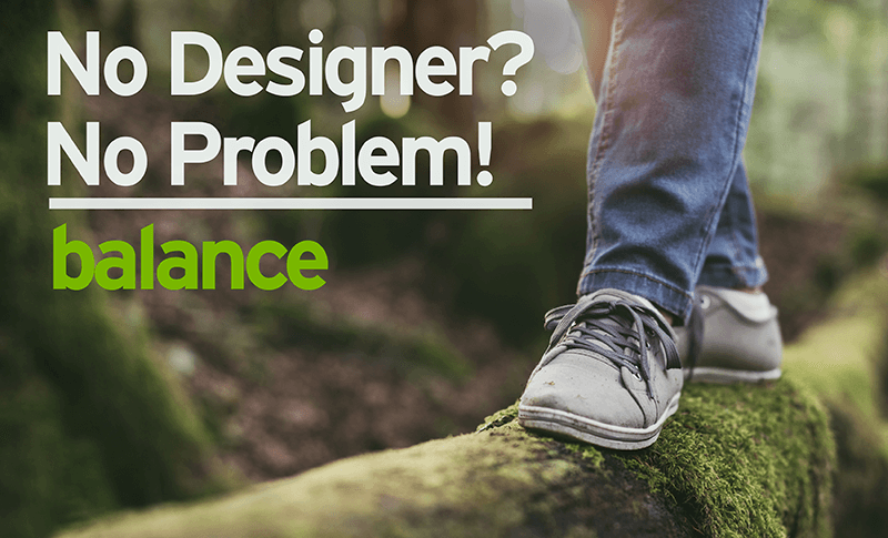
We all know what it feels like when our balance is off, right? That wobbly feeling we get when both feet aren’t planted firmly on the ground can be so disorienting.
Avoid that same disorientation in your graphic design and visual communications by creating your own balance.
Balance is providing equal weight to opposing sides – think top and bottom, left and right. When a design has balance it is more visually appealing than designs without it, making it a more enjoyable experience for your readers/viewers. They’ll want to engage more in your advertisement or social media graphic than if it didn’t have balance.
If a designed isn’t balanced, it truly can be disorienting. Viewers will quickly move on to the next visual vying for their attention and not even know why.
So how can you provide balance to your designs? Try these tactics:
- Equal visuals: whatever you do on one side of the design, do to the other. Say you have a large headline on the top of your flyer, put a large image across the bottom to balance out the top
- Opposite visuals: whatever you do on one side, use the same amount of space on the other, but make it empty. This is using white or negative space as a way to balance the heavy visuals. It’s one of my favorite ways to create balance as you are also providing the viewer with a spot to rest their eyes. We’ll cover this in more detail in a later article.
Let’s take a look at how balance is created in one of our recent designs for Progress Bank.
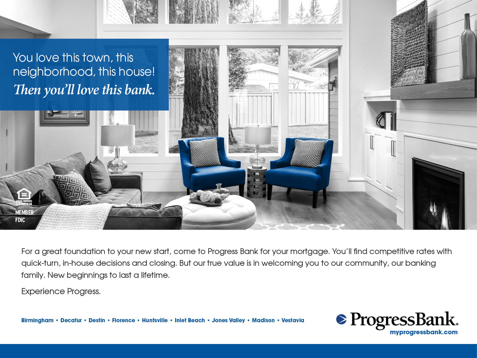
There’s nice balance between the top and bottom, which happens even though the two distinct image areas are not equal. The photo area is larger than the white space with the text, yet the design still feels balanced. That blue bar along the bottom? That’s the trick to providing more visual weight to balance the top.
There’s also a nice balance between the left side and right. The headline in the upper left is inside a visually heavy blue box, which is countered by the black logo in the bottom right of the ad. This placement also works well with the natural movement of readers – working from top left to bottom right – so that the last thing they see and (hopefully) remember is the name of the organization.
Let us know if you have any questions about how to bring balance to your designs. We’d love to see how you use it in your pieces!
Want tips like these delivered straight to your inbox? Sign up for our emails using the widget in the top right!