After so many decades in this business, we often forget that other people may not know some of the daily terms important to advertising, marketing, and design. As mindful as we are about cutting the designer jargon during meetings, emails, and calls, the occasional designer-y term still finds its way out.
So for those times and others when you find yourself needing to speak Designer here are some terms most often used and/or misunderstood.
WTH is kerning and tracking?
Kerning is simply adjusting the space between two letters. It is often manipulated to achieve better legibility or visual space. It is very similar to tracking, which generally means to adjust the spacing along the entire word. A reader can really notice kerning when it is applied to a large printed headline (it is tougher to manipulate kerning or tracking on digital headlines – not impossible, but tougher). In the image below, take a look at the difference between these three versions of the same word. Kerning has been applied to the one on the left, tracking applied to the one on the right.
![]()
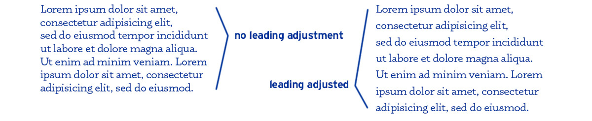
WTH is leading?
As long as we’re talking about the spacing in type, let’s go to leading (which rhymes with ‘wedding’). Like kerning and tracking, leading is also a helpful tool for increasing legibility, visual weight and space of the text. So what is it? Leading is the space between lines of text. It is similar to paragraph spacing tweaks made in word processing programs, but designers are able to more finely adjust that spacing, or leading.
This term, leading, like many others designers use, is actually based on typesetting. This skill was very important way back when printing was done using individual blocks for each letter. To separate a line of type from the next line of type below, typesetters would insert a piece of lead. And there you have it, ‘leading’ was born! OK, maybe I’m getting a little too excited about this?
What’s the difference between raster and vector?
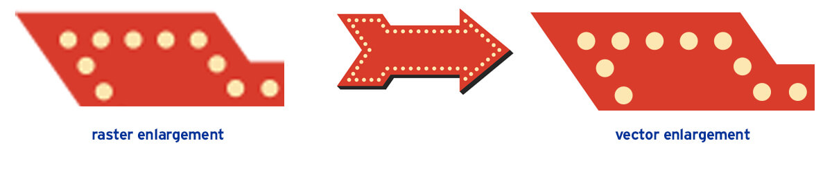
In other words, why do designers always ask for a vector-based EPS of your logo? Most digital images are built using pixels. A finite number of pixels are in each raster-based image, so when that image gets enlarged the pixels also get enlarged, distorting its original shape. That’s why when you make a tiny photo larger it starts to look fuzzy. The pixels making up that image have lost their original shape.
A vector-based image uses mathematical equations to create the image, so when that logo gets enlarged that equation just resets, so to speak. Luckily, we designers don’t need to know the equations (shew, I’m relieved!). They’re created automatically in programs like Adobe Illustrator. These equations are great at creating lines and colors, but can’t create photographic images. That’s why most of the digital photo-type images you see are raster-based and flat images, such as logos, can be vector-based. Take a look at the image below and you’ll see what happens when these two types of images each get enlarged.
What are those corner marks on that PDF? Trim? Cut? Bleed? Live?
Wow – sounds like a horror movie. Luckily, it’s nothing quite so violent. At least to humans. Paper may not be so lucky.
You know when you print something on your office printer you always end up with a white margin around the edges? Especially if you’re printing something with a lot of art such as an ad or a poster to review? Most printing machines need the edges to grab the paper and can’t spread the ink to the very edge. So when you print something at a printing business they print it larger than the size you need it, then trim it down. To allow for that trimming, designers take their art beyond the trim or cut edge of the layout. That is called the bleed area.
Magazines and other multi-page documents often have a looser tolerance when it comes to trimming their publications. In order to have your important information be safe, they often designate a ‘live area.’ This is usually a certain measurement inside the trimmed edge, where ‘bleed’ is outside the trimmed edge. You might also see a live (rhymes with ‘five’) area defined for those online, high-volume printers such as overnightprints.com or vistaprint.com.
We hope these help you navigate the strange world of print and digital design a little better. Have any terms or jargon you’d like explained? Leave a comment or send us an email!